Tell us what’s happening in your business — we’ll review and see how we can help you scale smarter.
Data-driven recommendations tailored to your goals
Benchmarks and proven frameworks used by high-growth brands
A quick diagnostic to spot your biggest conversion opportunities
Thank you! Your submission has been received!
Oops! Something went wrong while submitting the form.
Eva Mattress
CRO Optimization
A/B Testing
Expanded Menu on Navigation Bar: A User-Friendly Approach
Country
Malaysia
Services
Conversion Rate Optimization
Industry
Mattresses and Furniture
Technology
-
When it comes to providing users with an easy and efficient way to access products, menu bars are often an important element to consider. A clear and organized navigation helps to reduce clutter on the screen by eliminating unnecessary elements. By implementing an expanded menu, users can easily access a full product overview without having to click on the product categories. This approach is efficient for users to quickly browse through the product offerings and make quick decisions.
The Challenge
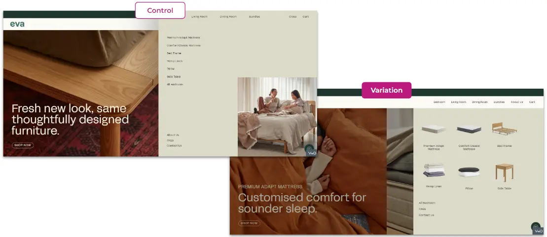
The original menu bar of Eva Mattress implemented a collapsed menu where users could only view the product names under the product categories. Users tend to have limited interaction with the menu bar which results in low conversion rates.
The Main Objective
An effective menu navigation is important in driving users to explore the products further and make an impact on conversion rates. In this case, we implement a new menu bar displaying product photos for Eva Mattress to optimize user browsing experience.
The key area of focus was to enhance the user journey by providing product overviews of each product category to users. The purpose is to educate users on product categories by providing them with a clear image of what the actual products look like. Eventually, it is aimed to increase user engagement towards the menu bar and lead to higher conversion rates.
Solution: Navigation Menu Optimization
A clear and intuitive navigation design is key to providing users with the best browsing experience which therefore encourages them to stay and explore the products. Essentially, the navigation should be simple and user-friendly, guiding users to their desired products with minimal effort.
For Eva Mattress, we implemented a navigation menu with one less layer of nesting. Under each product category, a small picture of each product is included to provide customers with a perception of what the product looks like. Users can view all the products by default once they click on the product category. With the visual indicators, this can help users to visually relate to the products which can effectively enhance the user experience. Compared to the previous version of the navigation menu, users can quickly jump to the product exactly what they are looking for, eventually positively impacting the overall conversion rates.
This is how the control and variations looked on the desktop:
Results
This test was a success as it captured a 38% increase in the navigation menu interaction. Users are more likely to click on the menu bar which provides a clear and organized product list. It eventually led to a 30% uplift in conversion rates, thanks to the navigation menu directing users to the products effortlessly with images.
The Key Takeaway: The Role of Menu Design and Placement
A clear and organized menu bar design can allow users to access the product they are looking for efficiently. Hence, an effective navigation menu allows users to move from page to page with ease. Showcasing product images in the menu is an excellent way to help users easily navigate to the desired products. It improves user experience, eventually increasing engagement and conversion rates.
Enhance your navigation menu bar with visuals provides users a seamless and intuitive navigation experience.
Heading 1
Heading 2
Heading 3
Heading 4
Heading 5
Heading 6
Lorem ipsum dolor sit amet, consectetur adipiscing elit, sed do eiusmod tempor incididunt ut labore et dolore magna aliqua. Ut enim ad minim veniam, quis nostrud exercitation ullamco laboris nisi ut aliquip ex ea commodo consequat. Duis aute irure dolor in reprehenderit in voluptate velit esse cillum dolore eu fugiat nulla pariatur.
We focus on tangible outcomes—not just design for design’s sake. Here’s what our clients typically see after we launch or revamp their Shopify websites:
+30%
Conversion Rate Uplift
+38%
Increase in Menu Interaction
Other Case Studies
CRO Optimization
A/B Testing
SaturdayClub
Boosted Sign-Ups And Fit Confidence For Higher Conversion
Read Case Study
CRO Optimization
A/B Testing
Clarks
Lifted ATC with Better Fit Clarity and Voucher Visibility
Read Case Study
CRO Optimization
A/B Testing
Montigo
Boost Conversions: 60% Add-to-Cart for Second Items with Optimized User Purchase Journey!
Read Case Study
Start your One-Time Optimization with us!
We’ll learn about your business goals and pain points to determine focus areas.


 Data-driven recommendations tailored to your goals


.png)